Overview:
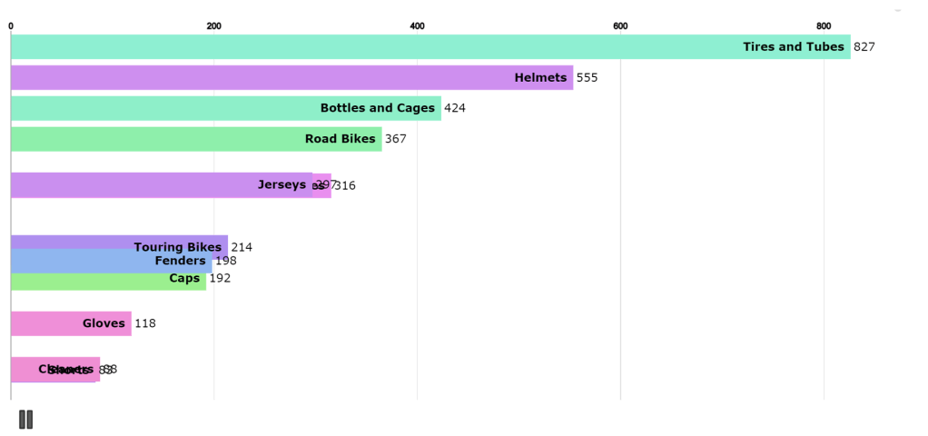
The Bike Sales Report (Animation Bar Chart) in PowerBI provides a dynamic visualization of sales data over time. By animating the bar chart, users can visually observe how different categories or metrics change over a specified period, offering a more engaging way to understand sales trends.
Screenshots

Key Features:
1. Animated Bar Transitions:
The Animation Bar Chart provides a dynamic visualization of sales data over time, where bars move and change in size, showing how sales evolve across different time periods or categories.
2. Time-Based Data Exploration:
The animation allows users to observe the progression of key sales metrics, making it easier to track trends and performance over months or years.
3. Interactive Focus:
Users can pause or replay the animation, zooming in on specific time frames to analyze changes in sales patterns more closely.
Category:
Tags:
Links:

Leave a comment